Dark mode
Material UI comes with two palette modes: light (the default) and dark.
Dark mode only
You can make your application use the dark theme as the default—regardless of the user's preference—by adding mode: 'dark' to the createTheme helper:
import { ThemeProvider, createTheme } from '@mui/material/styles';
import CssBaseline from '@mui/material/CssBaseline';

const darkTheme = createTheme({
  palette: {
    mode: 'dark',
  },
});

export default function App() {
  return (
    <ThemeProvider theme={darkTheme}>
      <CssBaseline />
      <main>This app is using the dark mode</main>
    </ThemeProvider>
  );
}
Adding mode: 'dark' to the createTheme helper modifies several palette values, as shown in the following demo:
Typography
palette.text.primary
#fff
palette.text.secondary
rgba(255, 255, 255, 0.7)
palette.text.disabled
rgba(255, 255, 255, 0.5)
Buttons
palette.action.active
#fff
palette.action.hover
rgba(255, 255, 255, 0.08)
palette.action.selected
rgba(255, 255, 255, 0.16)
palette.action.disabled
rgba(255, 255, 255, 0.3)
palette.action.disabledBackground
rgba(255, 255, 255, 0.12)
Background
palette.background.default
#121212
palette.background.paper
#121212
Divider
palette.divider
rgba(255, 255, 255, 0.12)
Adding <CssBaseline /> inside of the <ThemeProvider> component will also enable dark mode for the app's background.
Overriding the dark palette
To override the default palette, provide a palette object with custom colors in hex, RGB, or HSL format:
const darkTheme = createTheme({
  palette: {
    mode: 'dark',
    primary: {
      main: '#ff5252',
    },
  },
});
Learn more about palette structure in the Palette documentation.
System preference
Some users sets a preference for light or dark mode through their operation system—either systemwide, or for individual user agents. The following sections explain how to apply these preferences to an app's theme.
Built-in support
Use the colorSchemes node to build an application with multiple color schemes.
The built-in color schemes are light and dark which can be enabled by setting the value to true.
The light color scheme is enabled by default, so you only need to set the dark color scheme:
import { ThemeProvider, createTheme } from '@mui/material/styles';

const theme = createTheme({
  colorSchemes: {
    dark: true,
  },
});

function App() {
  return <ThemeProvider theme={theme}>...</ThemeProvider>;
}
When colorSchemes is provided, the following features are activated:
- Automatic switching between light and dark color schemes based on the user's preference
- Synchronization between window tabs—changes to the color scheme in one tab are applied to all other tabs
- An option to disable transitions when the color scheme changes
Accessing media prefers-color-scheme
You can make use of this preference with the useMediaQuery hook and the prefers-color-scheme media query.
The following demo shows how to check the user's preference in their OS or browser settings:
import * as React from 'react';
import useMediaQuery from '@mui/material/useMediaQuery';
import { createTheme, ThemeProvider } from '@mui/material/styles';
import CssBaseline from '@mui/material/CssBaseline';

function App() {
  const prefersDarkMode = useMediaQuery('(prefers-color-scheme: dark)');
  return <div>prefersDarkMode: {prefersDarkMode.toString()}</div>;
}
Toggling color mode
To give your users a way to toggle between modes for built-in support, use the useColorScheme hook to read and update the mode.
Disable transitions
To instantly switch between color schemes with no transition, apply the disableTransitionOnChange prop to the ThemeProvider component:
<ThemeProvider theme={theme} disableTransitionOnChange>
  ...
</ThemeProvider>
Styling in dark mode
Use the theme.applyStyles utility to apply styles for a specific mode.
We recommend using this function over checking theme.palette.mode to switch between styles as it has more benefits:
- It can be used with Pigment CSS, our in-house zero-runtime CSS-in-JS solution.
- It is generally more readable and maintainable.
- It is slightly more performant as it doesn't require to do style recalculation but the bundle size of SSR generated styles is larger.
Usage
With the styled function:
import { styled } from '@mui/material/styles';

const MyComponent = styled('div')(({ theme }) => ({
  color: '#fff',
  backgroundColor: theme.palette.primary.main,
  ...theme.applyStyles('dark', {
    backgroundColor: theme.palette.secondary.main,
  }),
  '&:hover': {
    boxShadow: theme.shadows[3],
    backgroundColor: theme.palette.primary.dark,
    ...theme.applyStyles('dark', {
      backgroundColor: theme.palette.secondary.dark,
    }),
  },
}));
With the sx prop:
import Button from '@mui/material/Button';

<Button
  sx={[
    (theme) => ({
      color: '#fff',
      backgroundColor: theme.palette.primary.main,
      ...theme.applyStyles('dark', {
        backgroundColor: theme.palette.secondary.main,
      }),
      '&:hover': {
        boxShadow: theme.shadows[3],
        backgroundColor: theme.palette.primary.dark,
        ...theme.applyStyles('dark', {
          backgroundColor: theme.palette.secondary.dark,
        }),
      },
    }),
  ]}
>
  Submit
</Button>;
Codemod
We provide codemods to migrate your codebase from using theme.palette.mode to use theme.applyStyles().
You can run each codemod below or all of them at once.
npx @mui/codemod@next v6.0.0/styled <path/to/folder-or-file>
npx @mui/codemod@next v6.0.0/sx-prop <path/to/folder-or-file>
npx @mui/codemod@next v6.0.0/theme-v6 <path/to/theme-file>
Run
v6.0.0/theme-v6against the file that contains the customstyleOverrides. Ignore this codemod if you don't have a custom theme.
API
theme.applyStyles(mode, styles) => CSSObject
Apply styles for a specific mode.
Arguments
mode('light' | 'dark') - The mode for which the styles should be applied.styles(CSSObject) - An object which contains the styles to be applied for the specified mode.
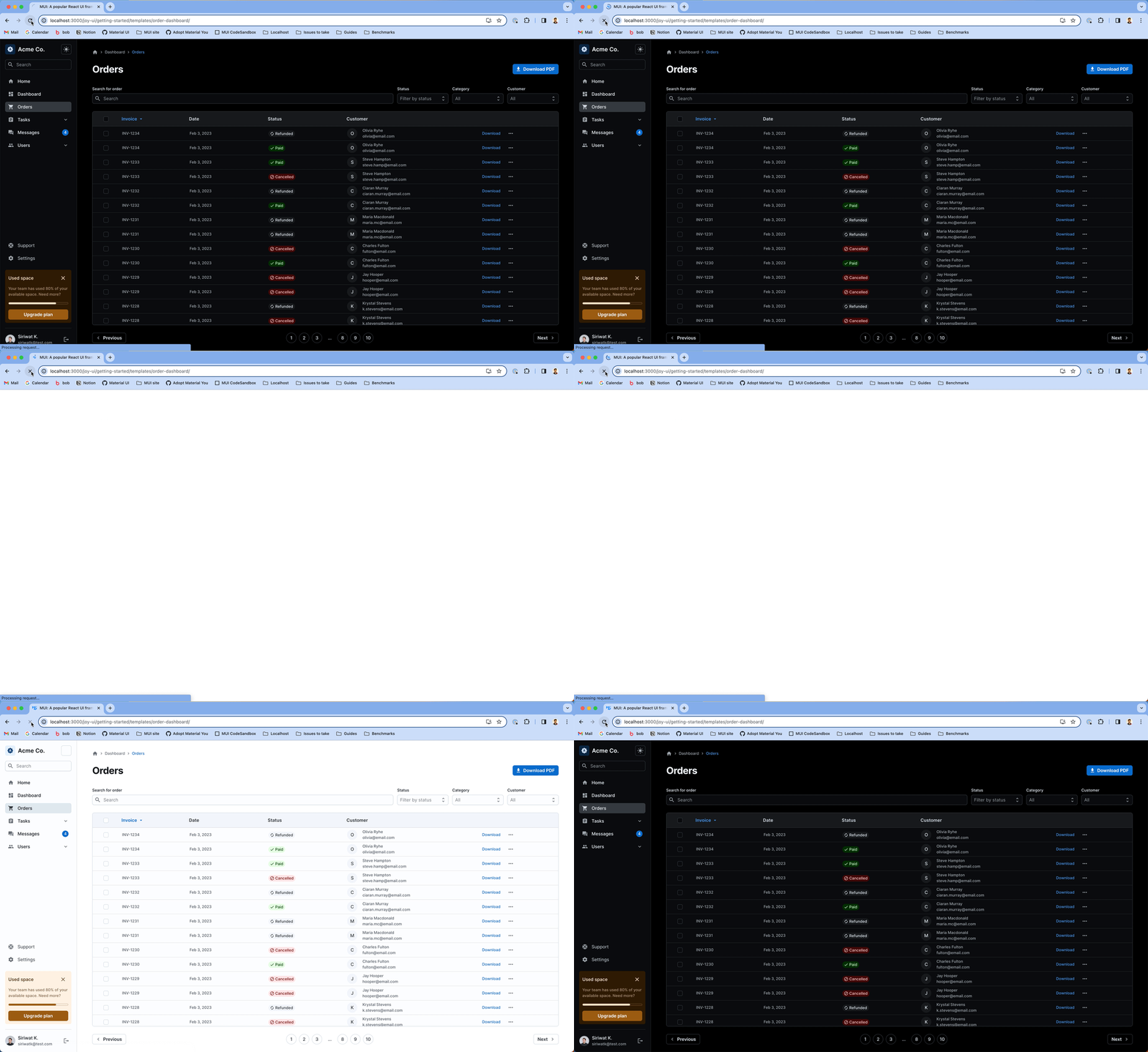
Dark mode flicker
The problem
Server-rendered apps are built before they reach the user's device. This means they can't automatically adjust to the user's preferred color scheme when first loaded.
Here's what typically happens:
- You load the app and set it to dark mode.
- You refresh the page.
- The app briefly appears in light mode (the default).
- Then it switches back to dark mode once the app fully loads.
This "flash" of light mode happens every time you open the app, as long as your browser remembers your dark mode preference.
This sudden change can be jarring, especially in low-light environments. It can strain your eyes and disrupt your experience, particularly if you interact with the app during this transition.
To better understand this issue, take a look at the animated image below:

The solution: CSS variables
Solving this problem requires a novel approach to styling and theming. (See this RFC on CSS variables support to learn more about the implementation of this feature.)
For applications that need to support light and dark mode using CSS media prefers-color-scheme, enabling the CSS variables feature fixes the issue.
But if you want to be able to toggle between modes manually, avoiding the flicker requires a combination of CSS variables and the InitColorSchemeScript component.
Check out the Preventing SSR flicker section for more details.