Migrating to v6
This guide explains how and why to migrate from MUI System v5 to v6.
Start using the beta release
In the package.json file, change the package version from latest to next.
-"@mui/system": "latest",
+"@mui/system": "next",
Using next ensures your project always uses the latest v6 beta release.
Alternatively, you can also target and fix it to a specific version, for example, 6.0.0-beta.0.
Breaking changes
Since v6 is a new major release, it contains some changes that affect the public API. The steps you need to take to migrate from MUI System v5 to v6 are described below.
Root code is now ESM
The ESM code, previously under the esm/ build, has been moved to the root of the package.
The CommonJS code, previously on the root, has been moved to the node/ build.
Grid
The Grid component was updated and stabilized:
- The previous size (
xs,sm,md, ...) and offset (xsOffset,smOffset,mdOffset, ...) props, which were named after the theme's breakpoints, were replaced with thesizeandoffsetprops. - The spacing mechanism was reworked to use the
gapCSS property.
This brings some breaking changes described in the following sections.
Stabilized API
The Grid component API was stabilized, so its import no longer contains the Unstable_ prefix:
- import { Unstable_Grid as Grid } from '@mui/system';
+ import { Grid } from '@mui/system';
- import Grid from '@mui/system/Unstable_Grid';
+ import Grid from '@mui/system/Grid';
Size and offset props
Previously, the size and offset props were named corresponding to the theme's breakpoints. For the default theme this was:
- Size:
xs,sm,md,lg,xl - Offset:
xsOffset,smOffset,mdOffset,lgOffset,xlOffset
In v6, these props are renamed to size and offset:
 <Grid
-  xs={12}
-  sm={6}
-  xsOffset={2}
-  smOffset={3}
+  size={{ xs: 12, sm: 6 }}
+  offset={{ xs: 2, sm: 3 }}
  >
Note that if the size or offset is the same for all breakpoints, you can use a single value:
-<Grid xs={6} xsOffset={2}>
+<Grid size={6} offset={2}>
Besides that, the true value for the size prop was renamed to "grow":
-<Grid xs>
+<Grid size="grow">
Use this codemod to migrate your project to the new size and offset props:
npx @mui/codemod@next v6.0.0/grid-v2-props <path/to/folder>
If you have custom breakpoints, the change is the same:
-<Grid mobile={12} mobileOffset={2} desktop={6} desktopOffset={4}>
+<Grid size={{ mobile: 12, desktop: 6 }} offset={{ mobile: 2, desktop: 4 }}>
Which you can cover with the same codemod by providing the custom breakpoints as an argument:
npx @mui/codemod@next v6.0.0/grid-v2-props <path/to/folder> --jscodeshift='--muiBreakpoints=mobile,desktop'
Removal of the disableEqualOverflow prop
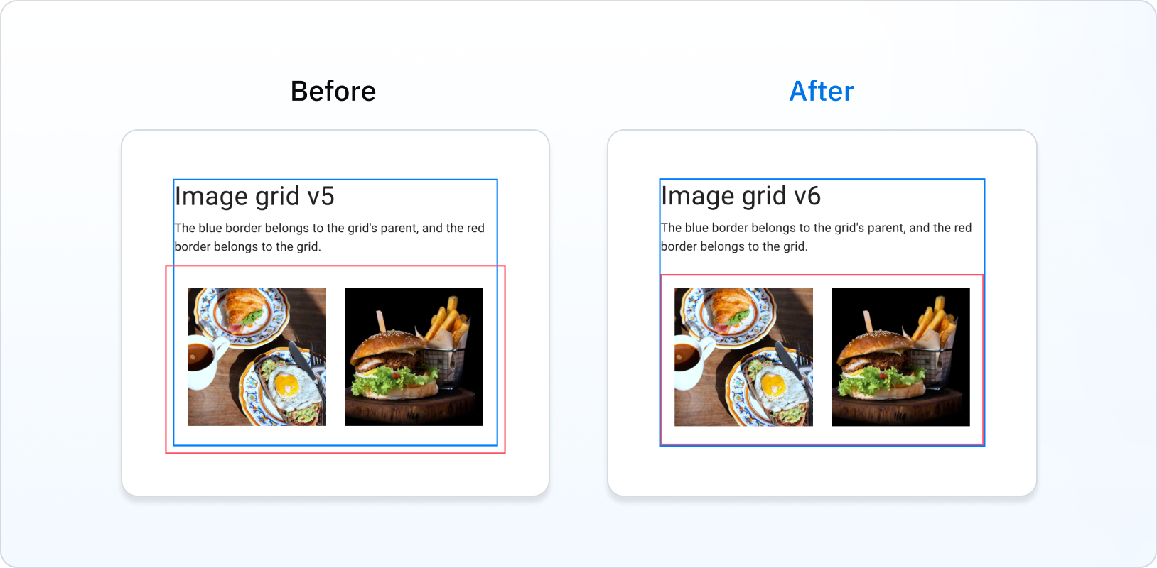
Previously, the Grid overflowed its parent. In v6, this is fixed, with the Grid being contained inside its parent's padding:

This removes the need for the disableEqualOverflow prop:
-<Grid disableEqualOverflow>
+<Grid>
Spacing is no longer considered inside the Grid item's box
Previously, Grid items included spacing in their boxes. In v6, this is fixed:

GridProps type
The cssGrid function's GridProps type has been renamed to CssGridProps.
This is to avoid collision with the GridProps type corresponding to the Grid component props.