Material UI Sync plugin
Sync is a Figma plugin that generates Material UI themes directly from design to code.
Introduction
Material UI Sync is a Figma plugin that lets you generate a theme from the Material UI for Figma Design Kit.
Running the plugin
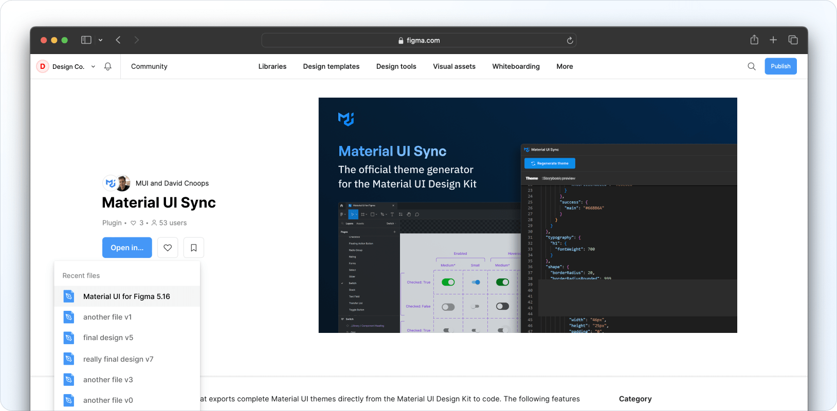
If you don't have the complete and latest version of the Material UI for Figma Design Kit installed, you can test the plugin by using the Community version instead.
After installing and opening it in Figma, head over to the Material UI Sync plugin page on the Community tab and click on Open in… and select the Material UI for Figma Design Kit.
Customizing design tokens
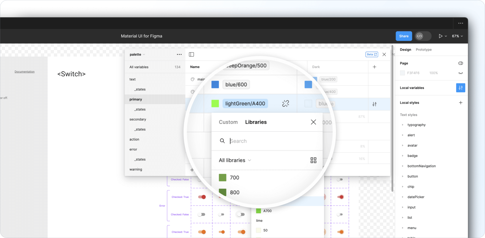
Design tokens are defined in the Design Kit's local variable collections and include color palettes, breakpoints, shapes, and spacing tokens. Typography and shadow-related tokens are found in the local styles collection.
Altering existing tokens
The Design Kit comes fully loaded with design tokens that map out to the default theme of the Material UI React library.
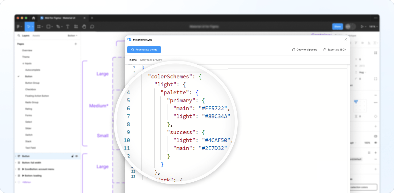
To customize existing tokens, open the local variable modal by clicking on the filter icon as shown below. Tweak any of the variables available in the collections (such as palettes, breakpoints, shapes, and spacing) as you see fit.
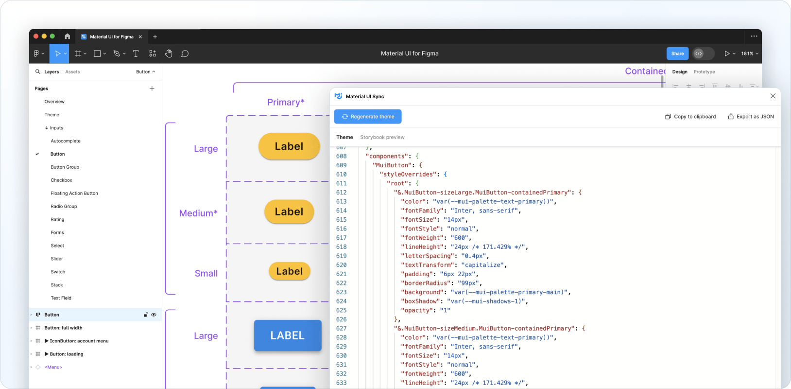
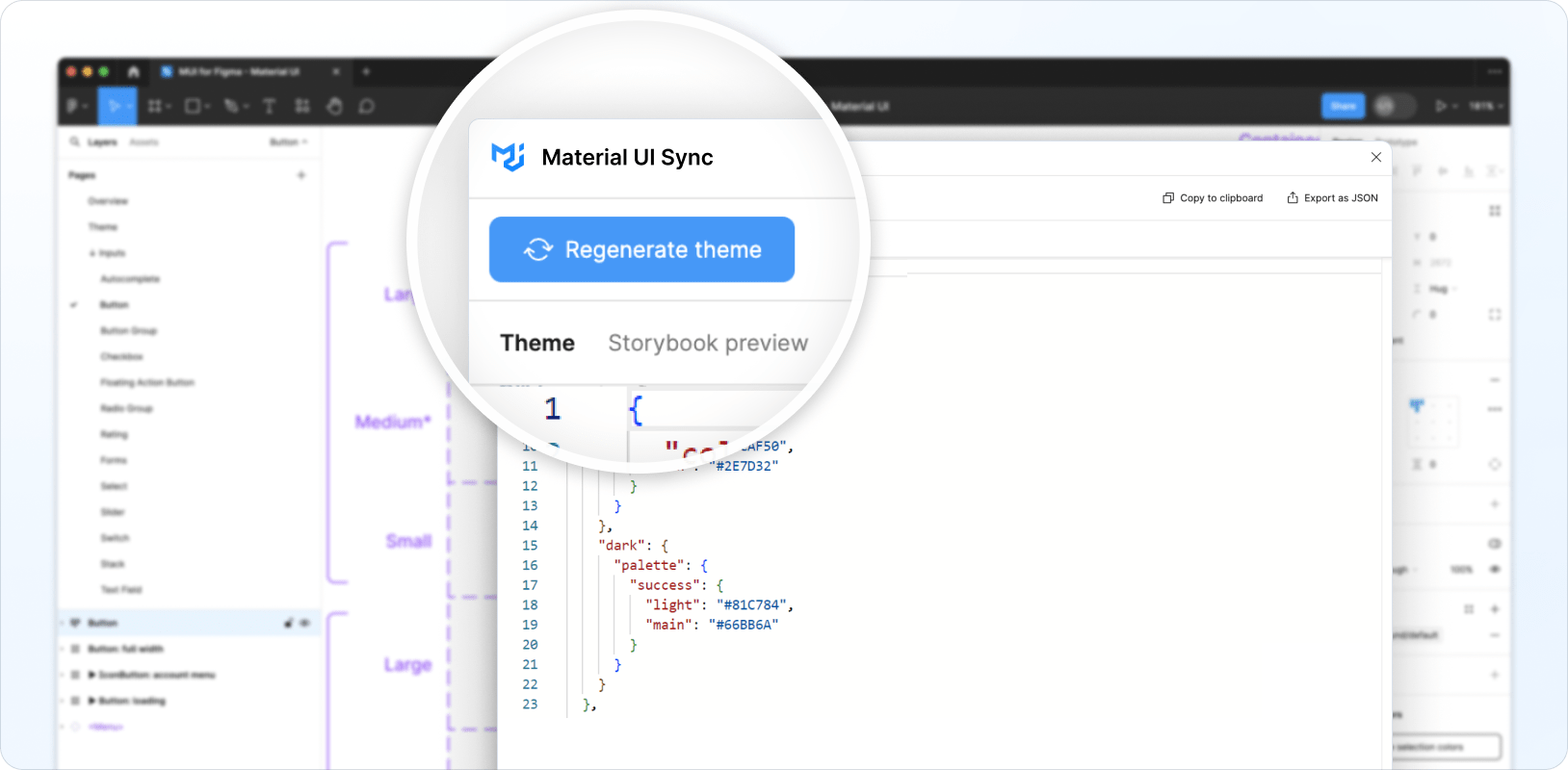
Then open the Material UI Sync plugin and click on Generate theme.
A theme containing the altered tokens is generated and displayed in the plugin's Theme tab.
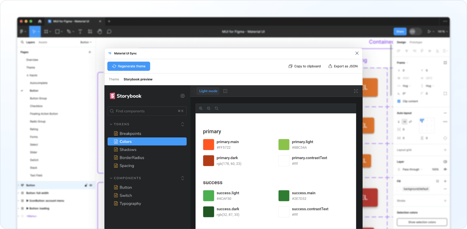
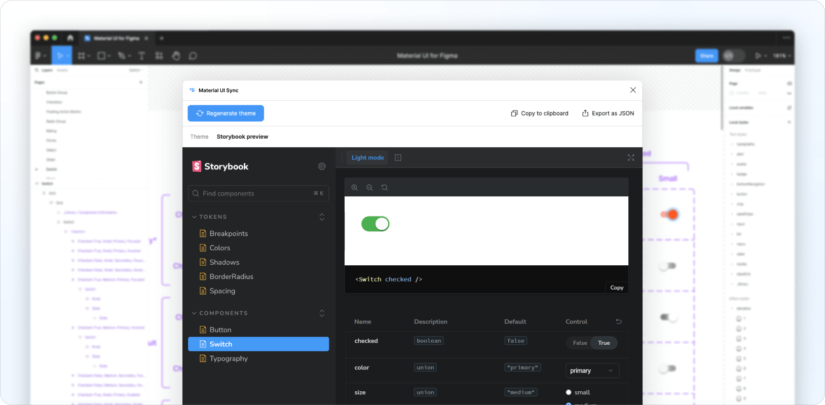
You can also preview the generated theme and the customized tokens by navigating to the Storybook preview tab.
Adding new tokens
You can extend the existing tokens set with your own either by adding new variables to the existing local variable collections, or by adding new elevation and typography styles to the local style collections. After you've added your custom tokens, click on Regenerate theme to include these tokens in your theme.
Customizing components
The Sync plugin can also generate theme styles for customized components, enabling you to completely change their look and feel and create your custom design system from within Figma.
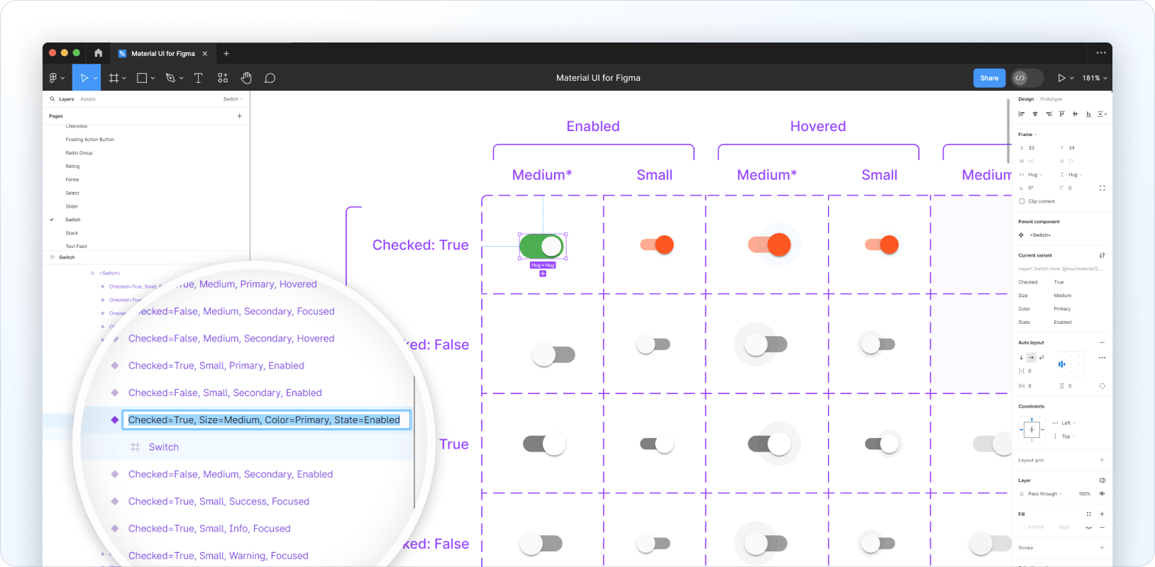
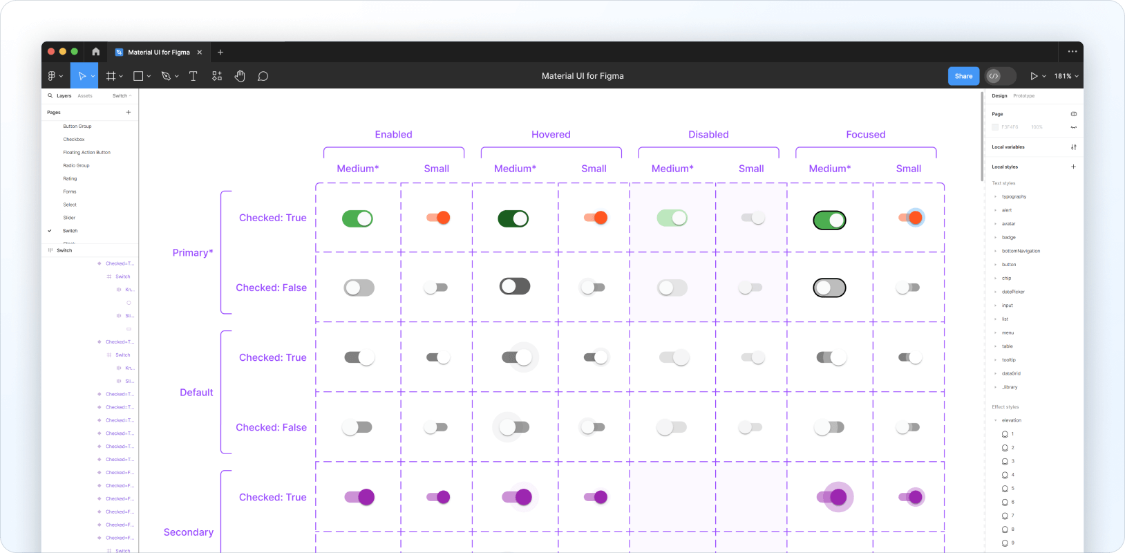
As an example, here's how to customize the checked state, medium size, and primary color of a Switch component to replicate the iOS look and feel:
The Sync plugin generates the following theme code for the customized Switch:
{
  components: {
    MuiSwitch: {
      styleOverrides: {
        root: {
          '&.MuiSwitch-sizeMedium:has(.MuiSwitch-colorPrimary)': {
            '&:has(.Mui-checked):not(:has(.Mui-disabled)):not(:has(.Mui-focusVisible))':
              {
                width: '40px',
                height: '21px',
                padding: '0',
                '& .MuiSwitch-switchBase': {
                  transform: 'translateX(19px) translateY(2px)',
                  padding: '0',
                  '& .MuiSwitch-thumb': {
                    width: '17px',
                    height: '17px',
                    background: '#FAFAFA',
                  },
                  '& + .MuiSwitch-track': {
                    width: '38px',
                    height: '21px',
                    background: 'var(--mui-palette-success-light)',
                    opacity: '1',
                  },
                },
              },
          },
        },
      },
    },
  },
}
The generated theme targets classes that correspond to the specific Switch configuration defined above, so styles are only applied when the props and state of the Material UI component match those of the customized Figma component.
To customize other states, you need to apply the desired design changes to each variant in Figma by following these steps:
- Customize a single "base" variant—for example, a Switch component in the checked state, of medium size, and primary color.
- Clone this variant and rename it to target the next variant you'd like to customize—for example, rename the cloned version of
Checked=True, Size=Medium, Color=Primary, State=EnabledtoChecked=False, Size=Medium, Color=Primary, State=Enabled. - Delete the old versions of the same variant.
- Move the new version to the correct square in the variant grid.
- Make the necessary style adjustments to the variant's child layers.
Repeat this process for each variant you want to customize. Here's an example of what this might look like:
From here you can run Sync to generate a new theme—here's what would be generated from the example above:
{
  components: {
    MuiSwitch: {
      styleOverrides: {
        root: {
          "&.MuiSwitch-sizeMedium:has(.MuiSwitch-colorPrimary)": {
            width: "40px",
            height: "21px",
            padding: "0",
            "& .MuiSwitch-switchBase": {
              padding: "0",
              "& .MuiSwitch-thumb": {
                width: "17px",
                height: "17px",
                background: "#FAFAFA",
              },
              "& + .MuiSwitch-track": {
                width: "38px",
                height: "21px",
                borderRadius: "100px",
                opacity: "1",
              },
            },
            "&:not(:has(.Mui-checked)):not(:has(.Mui-disabled)):not(:has(.Mui-focusVisible))": {
              "& .MuiSwitch-switchBase": {
                transform: "translateX(3px) translateY(2px)",
                "& + .MuiSwitch-track": {
                  background: "#BDBDBD",
                },
              },
            },
            "&:not(:has(.Mui-checked)):has(.Mui-disabled):not(:has(.Mui-focusVisible))": {
              "& .MuiSwitch-switchBase": {
                transform: "translateX(3px) translateY(2px)",
                "& + .MuiSwitch-track": {
                  background: "rgba(229, 229, 229, 0.99)",
                },
              },
            },
            "&:not(:has(.Mui-checked)):not(:has(.Mui-disabled)):has(.Mui-focusVisible)": {
              "& .MuiSwitch-switchBase": {
                transform: "translateX(3px) translateY(2px)",
                "& + .MuiSwitch-track": {
                  border: "1px solid #000",
                  background: "#BDBDBD",
                },
              },
            },
            "&:has(.Mui-checked):has(.Mui-disabled):not(:has(.Mui-focusVisible))": {
              "& .MuiSwitch-switchBase": {
                transform: "translateX(19px) translateY(2px)",
                "& + .MuiSwitch-track": {
                  background: "rgba(187, 231, 188, 0.99)",
                },
              },
            },
            "&:not(:has(.Mui-checked)):not(:has(.Mui-disabled)):not(:has(.Mui-focusVisible)):hover": {
              "& .MuiSwitch-switchBase": {
                transform: "translateX(3px) translateY(2px)",
                "& + .MuiSwitch-track": {
                  background: "#616161",
                },
              },
            },
            "&:has(.Mui-checked):not(:has(.Mui-disabled)):not(:has(.Mui-focusVisible))": {
              "& .MuiSwitch-switchBase": {
                transform: "translateX(19px) translateY(2px)",
                "& + .MuiSwitch-track": {
                  background: "var(--mui-palette-success-light)",
                },
              },
            },
            "&:has(.Mui-checked):not(:has(.Mui-disabled)):not(:has(.Mui-focusVisible)):hover": {
              "& .MuiSwitch-switchBase": {
                transform: "translateX(19px) translateY(2px)",
                "& + .MuiSwitch-track": {
                  background: "var(--mui-palette-success-dark)",
                },
              },
            },
            "&:has(.Mui-checked):not(:has(.Mui-disabled)):has(.Mui-focusVisible)": {
              "& .MuiSwitch-switchBase": {
                transform: "translateX(19px) translateY(2px)",
                "& + .MuiSwitch-track": {
                  border: "1px solid #000",
                  background: "var(--mui-palette-success-light)",
                },
              },
            },
          },
        },
      },
    },
  },
}
You can also check out the Storybook preview to test the Material UI version of your component.
Using the generated theme
Here's an example of how to add a Sync-generated theme to your codebase:
import { createTheme, ThemeProvider } from '@mui/material/styles';

export default function MyApp({ Component, pageProps }) {
  const theme = createTheme({
    cssVariables: true,
    shape: {
      borderRadiusRound: 999,
    },
    components: {
      MuiSwitch: {
        styleOverrides: {
          root: {
            '&.MuiSwitch-sizeMedium:has(.MuiSwitch-colorPrimary)': {
              '&:has(.Mui-checked):not(:has(.Mui-disabled)):not(:has(.Mui-focusVisible))':
                {
                  width: '40px',
                  height: '21px',
                  padding: '0',
                  '& .MuiSwitch-switchBase': {
                    transform: 'translateX(19px) translateY(2px)',
                    padding: '0',
                    '& .MuiSwitch-thumb': {
                      width: '17px',
                      height: '17px',
                      background: '#FAFAFA',
                    },
                    '& + .MuiSwitch-track': {
                      width: '38px',
                      height: '21px',
                      background: 'var(--mui-palette-success-light)',
                      borderRadius: 'var(--mui-shape-borderRadiusRound)',
                      opacity: '1',
                    },
                  },
                },
            },
          },
        },
      },
    },
  });

  return (
    <ThemeProvider theme={theme}>
      <Component {...pageProps} />
    </ThemeProvider>
  );
}
Feedback and bug reports
If you've got any feedback, we'd love to hear from you.